7 Calibration
This page is a work in progress and minor changes will be made over time.
Calibration measures evaluate the ‘average’ quality of probabilistic predictions, which in a survival context means assessing the quality of predicted distributions. In general there is a trade-off between discrimination and calibration. A model that makes perfect individual predictions (good discrimination) might be overfit to the data and make poor predictions on new, unseen data. Whereas a model that makes perfect population predictions (good calibration) might not be able to separate individual observations.
The literature on calibration measures for survival analysis is comparatively limited (Rahman et al. 2017), reflecting both conceptual and methodological challenges (Van Houwelingen 2000). Unlike metrics that evaluate predictions at the level of individual observations, calibration assesses the average agreement across the population. Whereas other measures can accommodate censoring through a combination of reweighting and dynamic restriction of the risk set, calibration requires a principled way to incorporate censored observations when estimating the population-level average. The majority of research into survival calibration measures appear to be focused on recalibrating Cox PH models (Demler et al. 2015; Van Houwelingen 2000). However, these methods are considered out of scope for this book, which focuses on measures that can generalize across all machine learning models.
A particularly useful taxonomy of calibration measures separates them into point calibration and distributional calibration methods (Andres et al. 2018). Point calibration considers calibration at a single time-point. For these measures to represent a genuinely useful quantity, the time-point must be carefully chosen. Often this is taken to be a meaningful horizon (for example, ‘5-year survival probability’) or the observed event time for each individual. Point calibration methods are most useful when there is a clear choice of time-point where the prediction should be optimized and when it is acceptable for the distribution’s calibration to be poor (or at least unknown) at other time points. Distributional calibration measures evaluate the prediction distribution across all time points. Therefore, these are preferred when the end goal is to predict and interpret the full survival distribution and the curve needs to be consistently calibrated.
7.1 Point Calibration
As above, point calibration measures evaluate distributions at a single time-point, usually a fixed time-horizon or the observed outcome time, these are discussed in turn.
7.1.1 Classification calibration methods
One could evaluate a predicted survival function \(\hat{S}\) at a meaningful time-horizon, \(\hat{S}{\tau}\), and then use standard classification calibration measures. One such measure is the Hosmer–Lemeshow test (Hosmer and Lemeshow 1980), which compares predicted probabilities with observed event frequencies across risk strata. These type of calibration measures are generally suboptimal for survival models. However, it is not uncommon to find them used in the literature and as such are briefly included in this book.
Even at a single time-point, censoring must be handled carefully. In binary classification, an observation is clearly an event or non-event but in survival analysis a censored individual does not fall neatly into one of these cases. Moreover, calibration at a single time point does not imply calibration at other times. In principle, one could repeat a classification calibration test across multiple time points with multiple testing correction. However, this would be less efficient and more difficult to interpret than other measures discussed in this chapter.
7.1.2 Event frequency calibration
As opposed to evaluating distributions at one or more arbitrary time points, one could instead evaluate distribution predictions at meaningful times. Van Houwelingen proposed several measures for calibration, which evaluate if “observed data are consistent with the expected data from the [predicted] model” (Van Houwelingen 2000). Only one of the proposed measures generalizes to all survival models that make distribution predictions, termed here event frequency calibration. Event frequency calibration defines a model as well-calibrated if, across the entire test set, the total number of observed events is close to the total number of events predicted by the model.
Formally, this result can be derived using counting process theory. A full derivation of the counting process formulation of survival analysis is provided in Appendix 2 of Hosmer Jr et al. (2011). The core theoretical relation underlying event frequency calibration is
\[ \mathbb{E}[\Delta_i] = \mathbb{E}[H_i(Y_i)], \]
that is, for an observation \(i\) with true event time \(Y_i\), the expectation of the cumulative hazard evaluated at that time-point equals the expected number of events for that individual.
Hence, event frequency calibration tests if the estimated cumulative hazard satisfies
\[ L_{EF} := \frac{\sum_i \delta_i}{\sum_i \hat{H}_i(t_i)} \approx 1, \]
where \(\hat{H}_i(t_i)\) is the cumulative hazard function from the predicted distribution for observation \(i\) evaluated at their observed outcome time \(t_i\), hence censored observations also contribute to the measure through the denominator.
For a loss that can be minimized, one may instead consider
\[ L_{EF^1} = \left\lvert 1 - \frac{\sum_i \delta_i}{\sum_i \hat{H}_i(t_i)} \right\rvert, \]
or
\[ L_{EF^2} = \left(1 - \frac{\sum_i \delta_i}{\sum_i \hat{H}_i(t_i)}\right)^2, \]
if a smooth, differentiable function is preferred; both options are minimized at \(0\).
7.2 Distributional Calibration
Calibration over a range of time points may be assessed quantitatively or qualitatively, with graphical methods often favoured. Graphical methods compare the average predicted distribution to the expected distribution, which can be estimated with the Kaplan-Meier curve, discussed next.
7.2.1 Kaplan-Meier Comparison
The simplest graphical comparison compares the average predicted survival curve to the Kaplan-Meier curve estimated on the testing data. Let \(\hat{S}_1,...,\hat{S}_n\) be the survival functions from predicted survival distributions, then the average predicted survival function at time \(\tau\) is,
\[ \bar{\hat{S}}(\tau) = \frac{1}{n} \sum^{n}_{i = 1} \hat{S}_i(\tau). \]
For other classes of metrics, predictions are made for previously unseen covariates and the ground truth from the unseen data is compared to the predictions. For calibration metrics, this is similarly achieved by fitting the Kaplan-Meier estimator, \(\hat{S}_{KM}\), to the observed survival outcomes, \((\mathbf{t}, \boldsymbol{\delta})\), from the test data and treating this as the average ground truth. Plotting \(\bar{\hat{S}}\) alongside \(\hat{S}_{KM}\) at all observed time-points provides a visual comparison of how closely these curves align. An example is given in Figure 7.1, a Cox proportional hazards model (CPH), random survival forest (RF), and relative risk tree (RRT), are all compared to the Kaplan-Meier estimator (KM). This figure highlights the advantages and disadvantages of this method. The relative risk tree is clearly poorly calibrated as it increasingly diverges from the Kaplan-Meier. In contrast, the Cox PH and random forest cannot be directly compared to one another, as both models frequently overlap with each other and the Kaplan-Meier estimator. Hence it is possible to say that the Cox PH and random forest are better calibrated than the risk tree, however it is not possible to say which of those two is better calibrated and whether their distance from the Kaplan-Meier is significant or not at a given time (when not clearly overlapping).
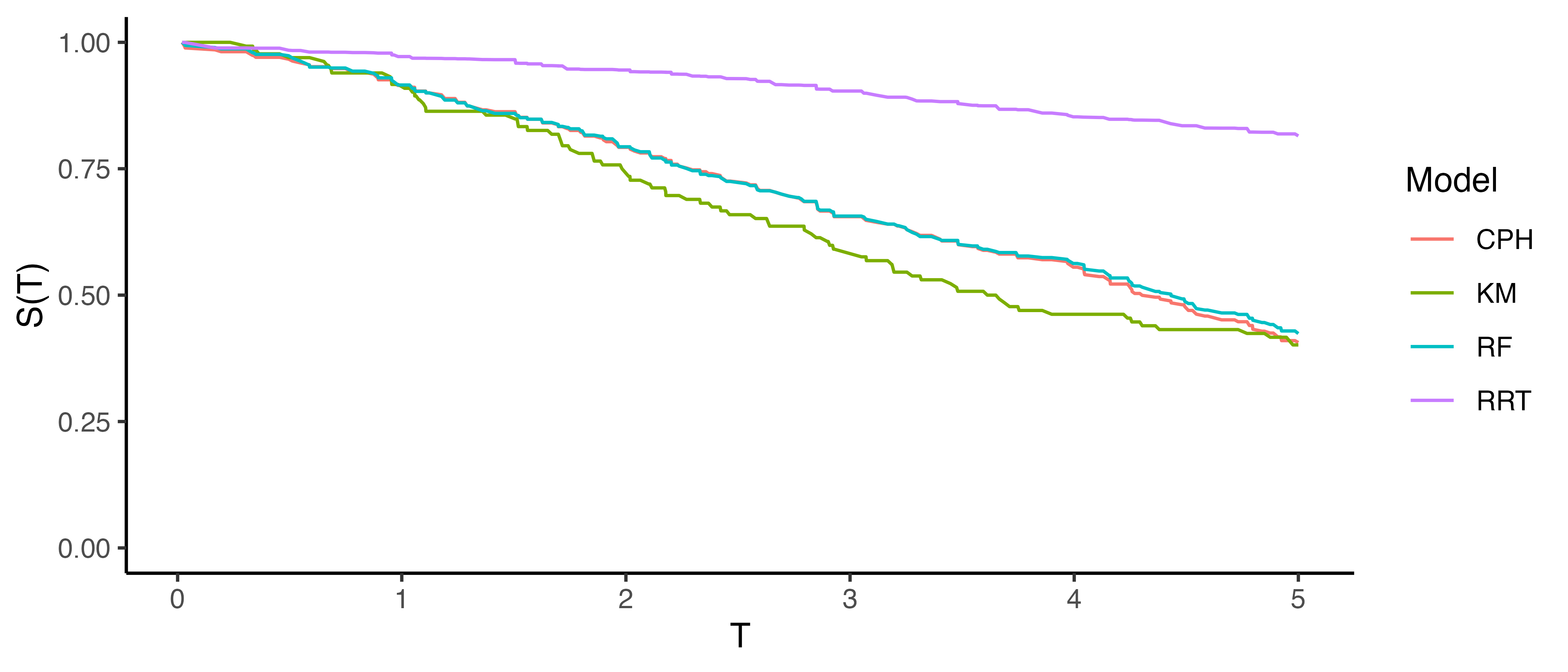
This method is useful for making broad statements such as “model X is clearly better calibrated than model Y” or “model X appears to make average predictions close to the Kaplan-Meier estimate”, but that is the limit in terms of useful conclusions. One could refine this method for more fine-grained information by instead using predictions to create ‘risk groups’ that can be plotted against a stratified Kaplan-Meier (Austin et al. 2020), however this method is harder to interpret and adds even more subjectivity around how many risk groups to create and how to create them (Royston and Altman 2013; Austin et al. 2020). The next measure we consider includes a graphical method as well as a quantitative interpretation.
As this approach depends on a non-parametric estimator to represent the ground truth, it can be naturally extended to other censoring and truncation settings by substituting the appropriate estimator. For example, replacing the Kaplan-Meier estimator with the non-parametric maximum likelihood estimator (Section 3.5.2) enables calibration when interval censoring is present, or using the left-truncated risk-set definition (Section 3.5.2.3) allows application to left-truncated data. Similarly, this approach can evaluate competing risks data by comparing predicted cumulative incidence functions (CIFs) for a particular event to the CIF estimated with the Aalen-Johanson estimator (Section 4.2.2) (Austin et al. 2022; Wolbers et al. 2009). However, interpretation becomes challenging in this setting as separate plots are required for each cause, making it difficult to assess overall calibration over multiple events.
7.2.2 D-Calibration
Recall that calibration measures assess whether model predictions align with population-level outcomes. In probabilistic classification, this means testing if predicted probabilities align with observed frequencies. For example, among all instances where a model predicts a 70% probability of the event happening, approximately 70% of the corresponding observations should actually experience the event. In survival analysis, calibration is extended by examining if predicted survival probabilities align with the actual distribution of event times. This is motivated by a well-known result: for any continuous random variable \(X\), it holds that \(S_X(X) \sim \mathcal{U}(0,1)\) (Angus 1994). This means that, regardless of whether the true outcome times, \(Y\), follow a Weibull, Gompertz, or any other continuous distribution, the survival probabilities evaluated at those times should be uniformly distributed in a well-calibrated model, \(\hat{S}_i(Y) \sim \mathcal{U}(0,1)\).
D-Calibration (Andres et al. 2018; Haider et al. 2020) leverages the fact that the event times, \(t_i\), are independent and identically distributed samples from the distribution of \(T\), which justifies replacing \(T\) with \(t_i\) (Lemma B.2 Haider et al. 2020) and so a survival model is considered well-calibrated if the predicted survival probabilities at observed event times follow a standard Uniform distribution: \(\hat{S}_i(t_i) \sim \mathcal{U}(0,1)\).
The \(\chi^2\) test-statistic is used to test if random variables follow a particular distribution:
\[ \chi^2 := \sum_{g=1}^G \frac{(o_g - e_g)^2}{e_g} \]
where \(o_g, e_g\) are respectively the number of observed and expected event counts in groups \(g = 1,...,G\). In this case, the \(\chi^2\) statistic is testing if there is an even distribution of predicted survival probabilities across the \([0,1]\) range. To do so the \([0,1]\) range is cut into \(G\) equal-width bins. Now let \(n\) be the total number of observations, then, under the null hypothesis, the expected number of events in each bin is equal: \(e_i = n/G\).
To calculate the observed number of events in each bin, first define which observations are in each bin. The observations in the \(g\)th bin are defined by the set:
\[ \mathcal{B}_g := \{i = 1,\ldots,n : \lceil \hat{S}_i(t_i) \times G \rceil = g\} \]
where \(i = 1,\ldots,n\) are the indices of the observations, \(\hat{S}_i\) are predicted survival functions, \(t_i\) are observed outcome times, and \(\lceil \cdot \rceil\) is the ceiling function. For example, if there are \(5\) bins then the bins are \(\{[0, 0.2], (0.2, 0.4], (0.4, 0.6], (0.6, 0.8], (0.8, 1]\}\). So observation \(i\) would be in the fourth bin if \(\hat{S}_i(t_i) = 0.7\) as \(\lceil 0.7 \times 5 \rceil = \lceil 3.5 \rceil = 4\). Finally, the observed number of events is the number of observations in the corresponding set: \(o_g = |\mathcal{B}_g|\).
The D-Calibration measure, or \(\chi^2\) statistic, is then defined by:
\[ D_{\chi^2}(\hat{\mathbf{S}}, \mathbf{t}) := \frac{\sum^G_{i = 1} (o_i - \frac{n}{G})^2}{n/G} \]
where \(\hat{\mathbf{S}} = (\hat{S}_1 \ \hat{S}_2 \cdots \hat{S}_n)^\top\) and \(\mathbf{t}= (t_1 \ t_2 \cdots t_n)^\top\).
This measure has several useful properties. Firstly, one can test the null hypothesis that a model is ‘D-calibrated’ since, under the null, \(D_{\chi^2}\) asymptotically follows a \(\chi^2_{G-1}\) distribution, from which a \(p\)-value can be obtained. Secondly, \(D_{\chi^2}\) tends to zero as a model is increasingly well-calibrated, hence the measure can be used for model comparison. Finally, the theory lends itself to an intuitive graphical calibration method, known as reliability diagrams (Wilks 1990). A D-calibrated model implies:
\[ p = \frac{\sum_i \mathbb{I}(t_i \leq \hat{F}_i^{-1}(p))}{n} \]
where \(p\) is some value in \([0,1]\), \(\hat{F}_i^{-1}\) is the \(i\)th predicted inverse cumulative distribution function, and \(n\) is again the number of observations. In words, the number of events occurring at or before each quantile should be equal to the quantile itself, for example 50% of events should occur before their predicted median survival time. Therefore, one can plot \(p\) on the x-axis and the right-hand side of the above equation on the y-axis. A D-calibrated model should result in a straight line on \(x = y\). This is visualized in Figure 7.2 for the same models as in Figure 7.1. This figure supports the previous findings that the relative risk tree is poorly calibrated in contrast to the Cox PH and random forest but again no direct comparison between the latter models is possible.
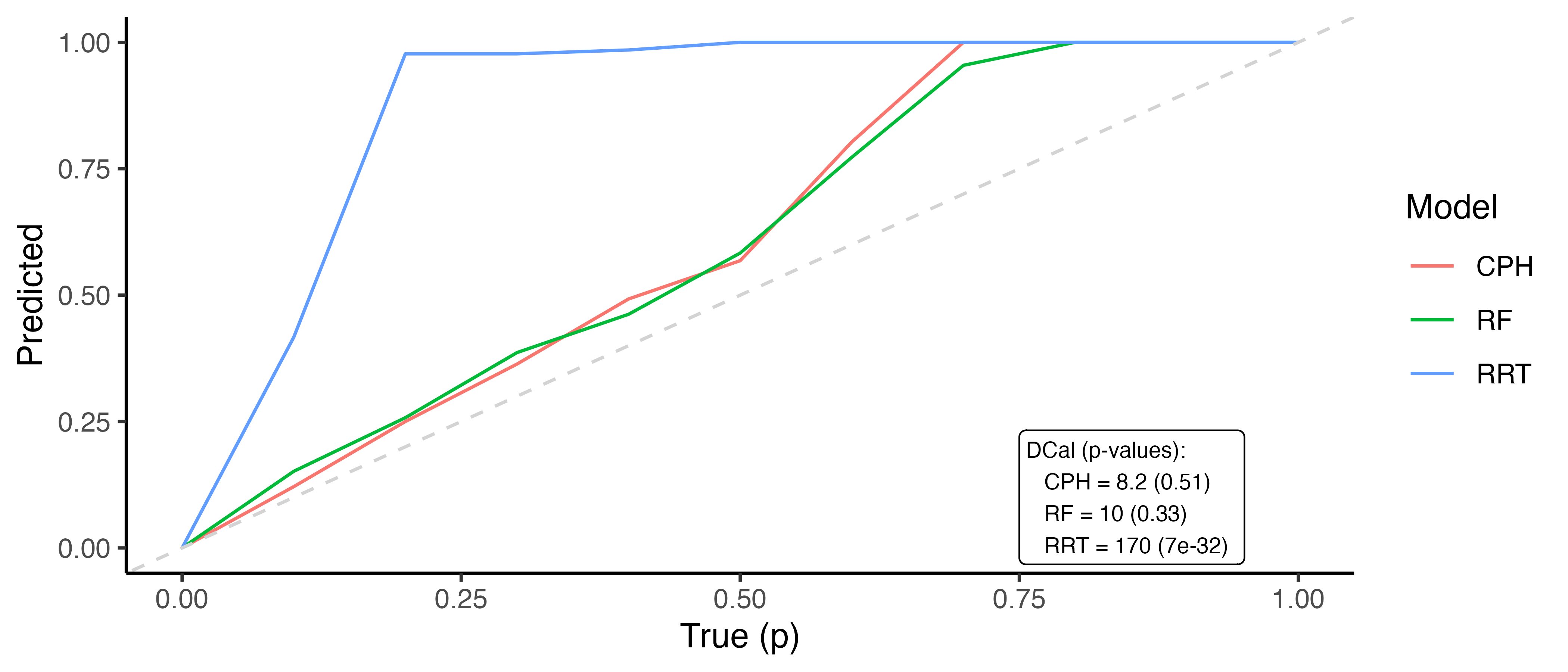
Whilst D-calibration has the same problems as the Kaplan-Meier method with respect to visual comparison, at least in this case there are quantities to help draw more concrete conclusions. For the models in Figure 7.2, it is clear that the relative risk tree is not D-calibrated, which is confirmed with \(p<0.01\) indicating the null hypothesis of D-calibration (predicted survival probabilities follow standard Uniform) can be comfortably rejected. Whilst the D-calibration for the Cox PH is smaller than that of the random forest, the difference is unlikely to be significant, as is seen in the overlapping curves in the figure.